A checklist to improve your product UI
This story will be especially useful for beginners, but all designers can keep these tips in mind, regardless of experience. It is is less about design trends and fashion, and more about foundational design principles, which are often forgotten. Here is a list of principles to help to improve your designs.
1. Typography
It would be good to start with the statement that you shouldn’t use more than 2 fonts, as well as their multiple styles, in one project, but I believe that this has become too obvious, and I hope that everyone follows this principle anyways. Let’s talk about more specific matters.
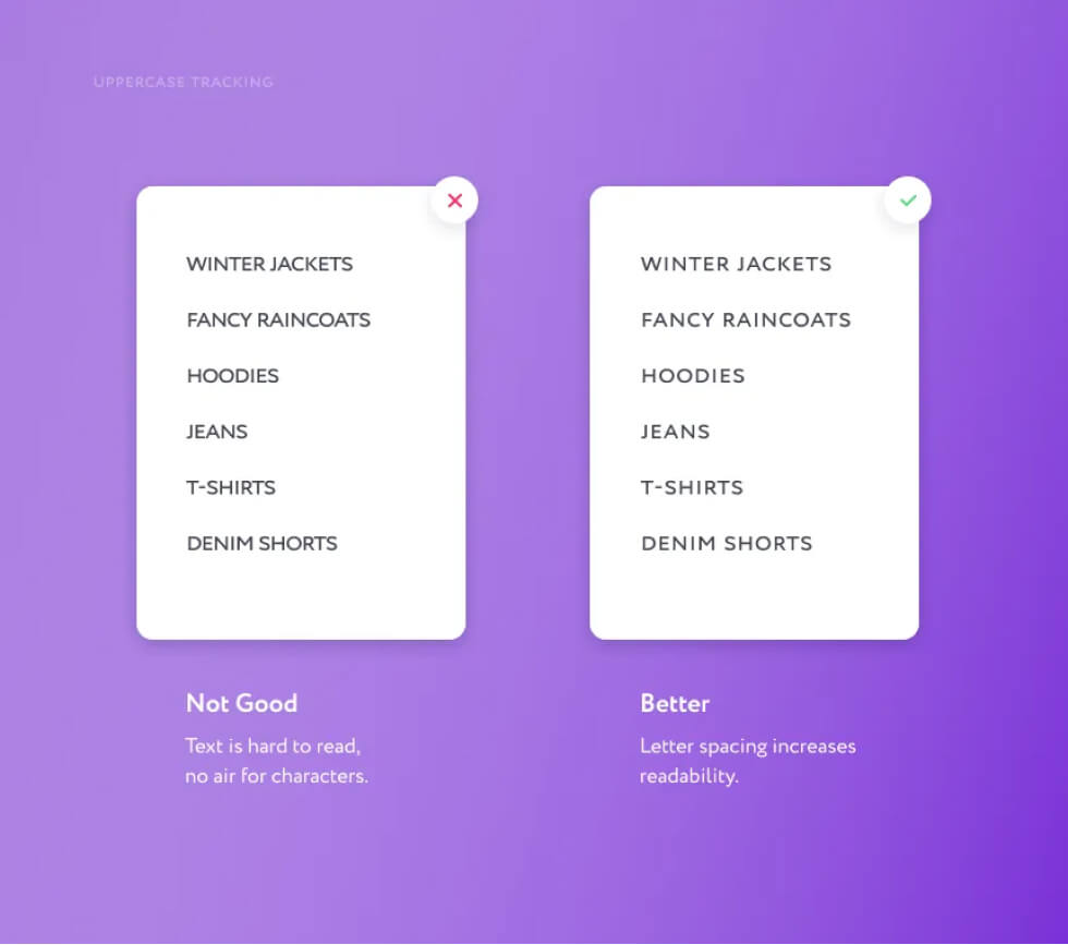
Uppercase Tracking
Each time you use text that consists entirely of capital letters, don’t forget to set up letter spacing. This will prevent characters from sticking to one another and will make the text more readable.
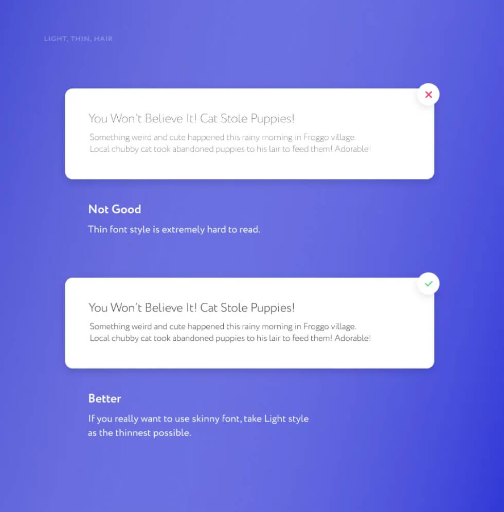
Light, Thin and Hair Font Styles
You need to be careful with these styles. Light can be used, but it depends on the font. If you are making a product that users will eventually see on screens, it is better to forget about Thin and Hair styles.They are extremely hard to read and can create the effect of broken half-pixels on some screens.
Headings and Main Text Font Sizes
Let’s talk about web typography. There are six levels of headings (h1 — h6). First you should make sure you have no more than four in your project and control their logic and consistency. The largest heading (may occur in the first block of the main page) of a website or a landing page may be as large as you wish: current trends encourage expressive typography. However, make sure not to go too far with the rest of your headings, because too large text is as difficult to read as a too small. Now for the main text. A browser default settings (let’s use Google Chrome as reference) will display every text in 16px size. This size is quite comfortable to read, but I tend to use not less than 17px for the main text and 14px for additional text. Reserve 12px as the least possible size while lesser sizes become barely readable due to eyesight issues or bad monitors. Remember to avoid close range sizes. Don’t use 16px and 17px in the same segments: this brings confusion and visual untidiness to the appearance of the product and is just entirely unreasonable.
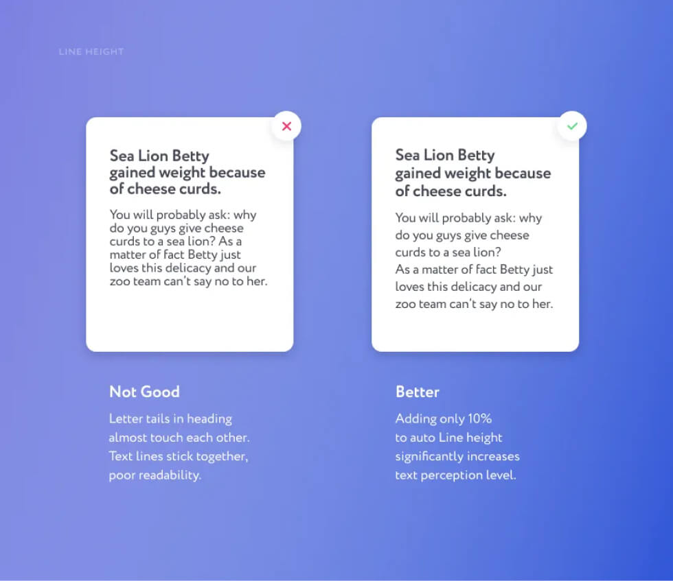
Line Height
You could rarely leave line height setting in auto value. Usually you’d have to increase it a little to improve readability. This is especially true for large text blocks: blogs, articles and info blocks of websites or mobile apps. The same approach is justified for headings: make sure that letter’s tails don’t touch each other.
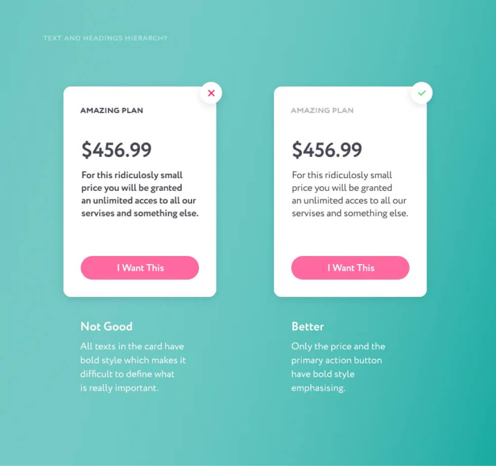
Text and Headings Hierarchy
Bold text should be used to highlight important parts of a text. This includes headings, links and buttons and sometimes emphasized segments of the text. If bold style is used for the entire text, it will become unclear where to look, and what is more important. Put the emphasis correctly: everything may not be equally important.
2. Spacing & Margins
Negative space (the “air” between elements ) is essential for a good design. Space helps to clarify relations between elements, provides rhythm and balance.
Get Rid of Extra Frames and Lines
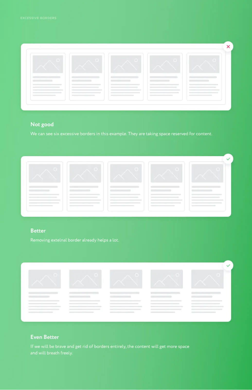
The easiest way to separate one semantic block from another is to use a frame or a 1px line. This is not always the best approach though. I’ve seen design pieces where there was a box inside a box and with several more boxes inside, each box had it’s own 1px frame. In such situations, you need to stop and think: is this really appropriate and necessary? Today’s interfaces tend to have cards everywhere: card at an online store, card in an animal care application, card of a restaurant which delivers your favourite pizza in a delivery app. Sometimes it’s reasonable to use a 1px frame, but there are other ways of distinguishing such elements, like shadows or spacing. The main thing is that margins between cards should be greater than paddings inside them. Disposal of frames on any element could save space for content as long as you won’t need extra space for inner margins. After all, it is the content that is the most important part of any product, so do not unjustifiably cut off the space reserved for it.
What Belongs Where?
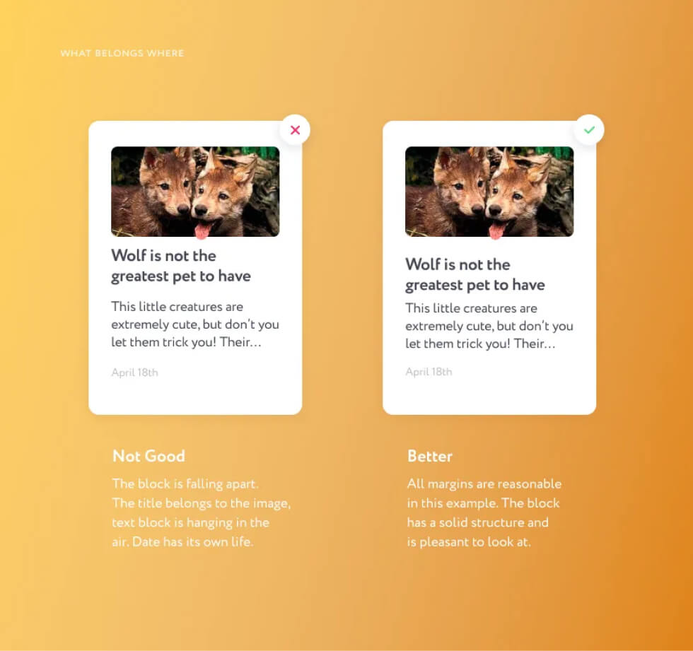
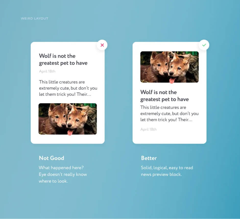
Margins help visually determine whether one element belongs to another. Let’s consider the layout of an article on a news site. Let’s say it consists of one picture, a heading, 3–4 lines of preview text and the date of publishing. The heading should “marry” the text and make up a solid element. The date should have a slightly larger margin than the margin between the heading and text. Finally, the picture should be moved as far from the heading-text unit as the date is, or even farther. Sounds confusing? Better look at the related picture below.
Less is More
There’s always a client or a manager who demands that all information has to be fitted in one block or a one mobile app screen. So the title, and the phone, and the entire menu, and the special offer will fit. And don’t forget a big-big logo. I’m not much of a negotiator and can’t come up with an easy trick how to make them change their mind. But at least you could say this: the less information a user receives at once, the easier for him it would be to take action (for example, make a phone call). Gradual information intake ensures easier and more pleasing customer experience. A customer should never have a hard time deciphering your interface layout — no one ever wants that. And a pile of tightly grouped elements is unaesthetic and in the end, ugly.
Uneven Screen Edge Margins
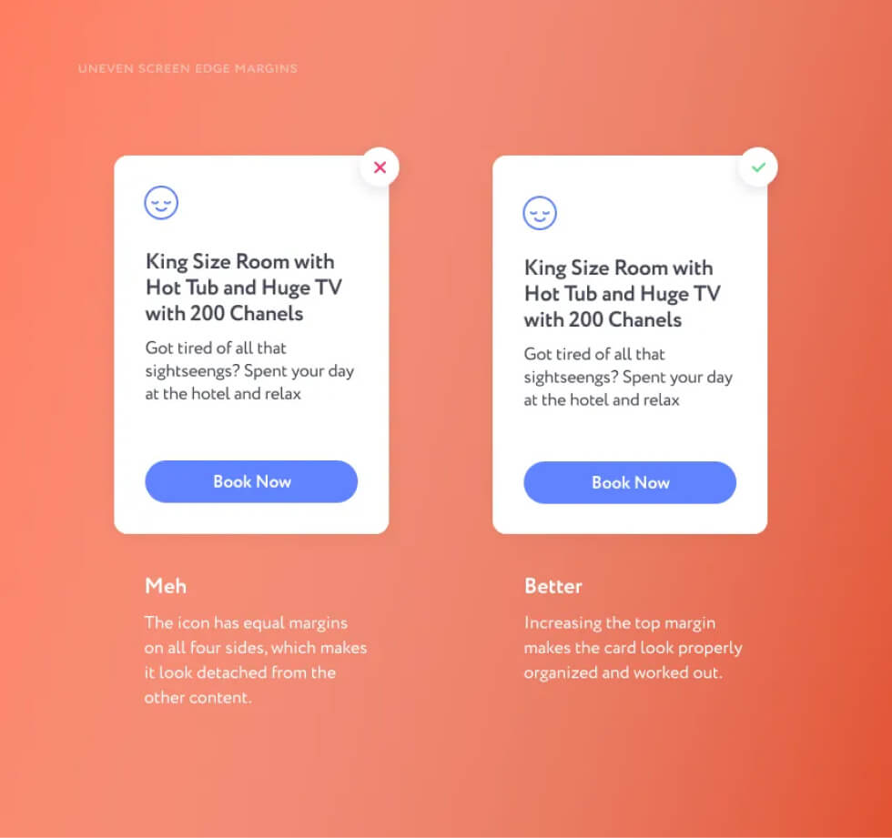
If you work on a poster, a banner or our favourite card, then pay attention to margins from the edges. If you lay the content out in a classic way — from top left to bottom right corner — make the top margin a little bigger than the left one. This looks more appealing than even margins on all sides.
3. Color and Images
Images, icons and backgrounds set the product mood. Images should demonstrate exactly what a company, an app or a website offers.
Some Logo Thoughts
I don’t do logos too often, I’ve made like 20 of them during my career, and here is what I’ve learned: a good logo is very difficult to make. However, a designer can surely create a decent logo, just following basic rules and principles. For example, careful color selection. Once I saw a fishing store called “VIP catch” with a purple logo. The combination of purple and the word “VIP” doesn’t really create an association with fishing. In general, you can use any color for any industry, unless there is a clear disconnect such as the “XXX VIP Catch” purple scenario. Another logo tip: if you are having a hard time putting an image (a symbol) to a logo — just don’t do it. Try to make it a font-only logo, do less and do better. Spare this world another legal office with a seal or scales on their logo.
Shadows
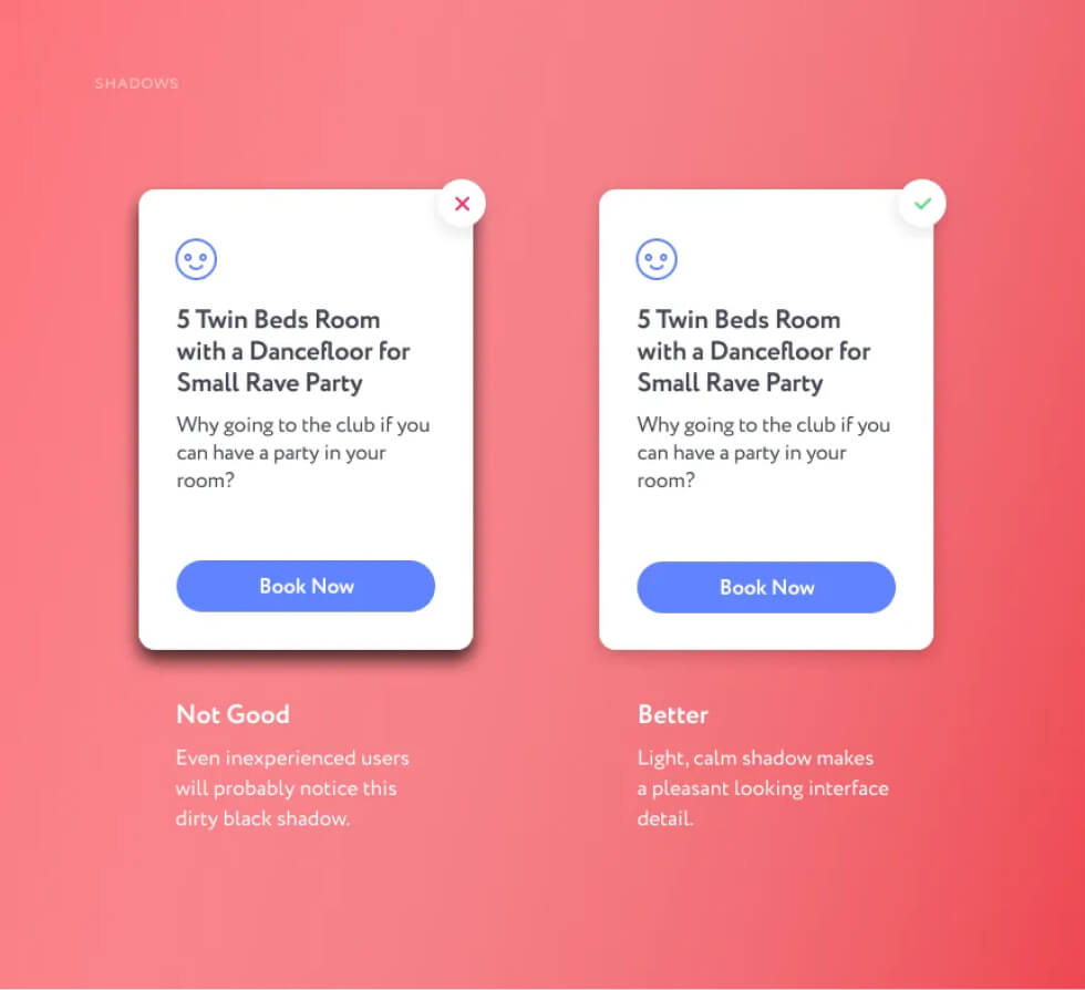
The shadow under an object should never be black. It will always be a darker shade of the surface on which it is cast. Objects usually have several shadows: one is small and bright, directly below it (if it is standing or lying on something), and the second one is more blurry and transparent. Avoid “dirty”, unnatural shadows in your project.
Icons and Images
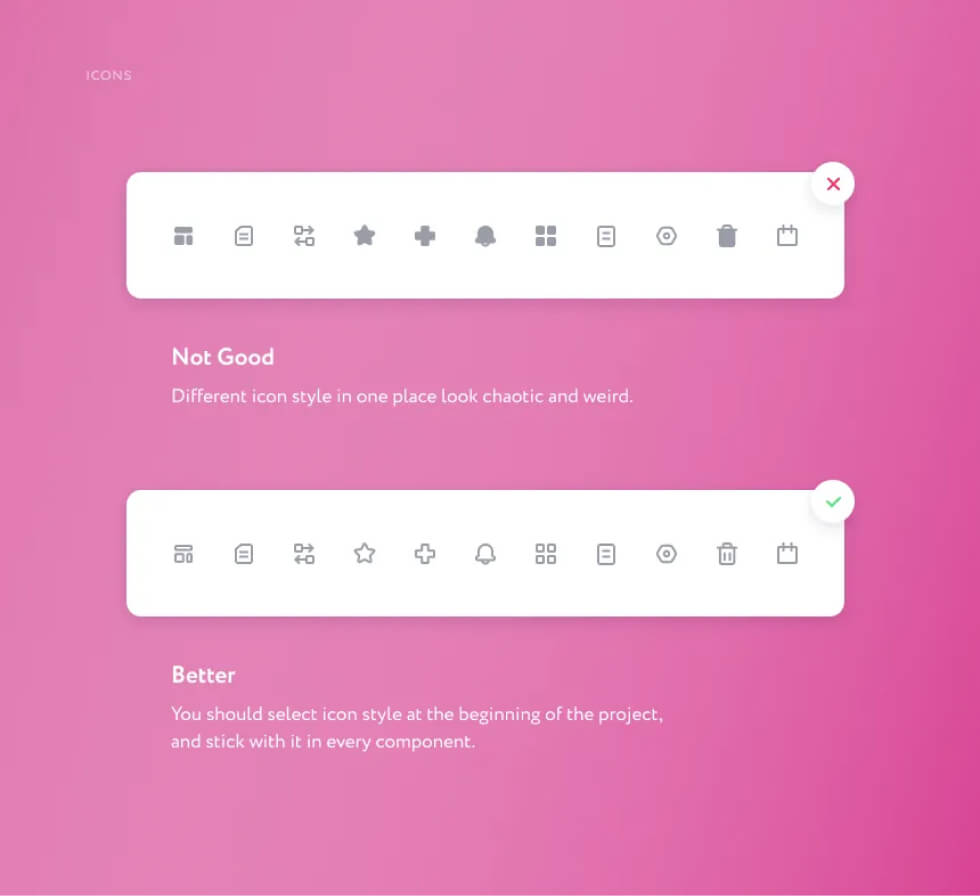
Anything that can be vector should be vector. All pictograms, arrows and logos should be given to developers in SVG format (PDF for iOS development). PNG icons have blurry edges and look bad, especially on retina displays. Besides, vector images occupy less memory.
More About Icons
Anything that can be vector should be vector. All pictograms, arrows and logos should be given to developers in SVG format (PDF for iOS development). PNG icons have blurry edges and look bad, especially on retina displays. Besides, vector images occupy less memory.
4. Common Sense
There are a few more things I’d like to tell about, but I didn’t figure out how to categorize them, so I put them in this section.
Avoid Weird Layouts
Let’s go back to the news preview example we studied in the Space and Margins section. If we arrange the elements (image, title, text and date) in an unconventional order, it may become confusing. Try sticking to familiar interface layouts. Familiar does not necessarily mean boring, you could always display creativity in other parts of the project. Avoid experimental positioning of elements on a screen / page / card without good reason. Otherwise the user may get confused and leave your site or delete the application. Remember that a designer and an artist are different professions. In design we create a product for people, which means your personal creative impulses can be applied only where it will not interfere with the user experience.
Layout Sizes and Measurements
Before starting design on a mobile app, it is important to ask the developers about screen sizes. Usually it will be 320px for iOS and 360px for Android. While it is more or less clear and predictable with mobile apps, a website design may be challenging since it will be used on a wide range of devices. The following situation was very common in my own experience as a frontend developer: the provided layout was made for huge monitors. There were margins of 400–600 pixels between blocks, huge font sizes, a strange grid. It’s lucky that I’m also a designer and I could fix this problem myself by adjusting margins and sizes to make it look good on any screen. However, frontend developers usually don’t have a design background and will implement the design exactly the way it was provided to them. As a result, elements will be too big on a common laptop screen. Note that an average laptop screen limit is about 700px vertically, so try to fit one semantic block into this measurement.
Lorem Shmipsum
The Lorem Ipsum sample text in your design looks cheap and unprofessional so avoid using it. It only reveals that a designer was lazy to create some decent content. Moreover, you no longer have to create it on your own, there’s bunch of plug-ins for Sketch and Figma that will generate content for you. Another tip: try not to duplicate blocks, even if it is just for a demo purpose. Put different pictures, headings and preview texts of different length.
Conclusion
Every rule has its exceptions. All given advice is never meant to be a dogma and there will always be a case where you should do the opposite. But in most cases these tips will help improve your design. I hope this was a helpful article! Thank you for reading.